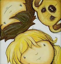
I did the artwork and gave it to Hodder's before leaving for my travels in May.
They have sent back a design idea, and I have today adjusted it to have a slightly different font, more 'stencil' like, and added some arrows to make it more 'cardboard-boxy'.
This is the original cover idea...
...then...
...I've adjusted and added a few bits....and changed some colours.


I like the yellow / brown cardboard feel cover with the arrows, but for the age ramnge of under fives maybe the blue cover with the first font with arrows on too would work best?
ReplyDeleteYeah, it's difficult to judge when the audience I am aiming at is kids (5 years)but it's adults who will actually buy the book.
ReplyDeleteAlso I want the cover to work graphically/artistically, as this will ultimatley set my style as an author/illustrator, but similarly I want it to be successful, otherwise I might not get the chance to do others in the future.
Personally I like the cardboard brown design, but maybe the blue, clearer text design would be more successful.
I am confused.com!
It's a difficult one
I definitely prefer the first option, the type lends itself much more to a children's book!
ReplyDeleteThanks Dan. Really appreciate your input. The more i look at the first option, the more I like it. It seems 'stronger' than the other designs...or maybe just clearer, especially for the audience.
ReplyDeleteThanks again mate. You website looks cool. xhx
Hmmm. I think the type does not lend itself to your style hayley. I think you need to take off the this way up as this connotes removal vans to me and does not say I am an illustrator.
ReplyDeleteThe colors are wicked in blue and the actual illustrations are great but I think the type could be illustrated too or have some of the same elements of the pop up idea within it. Not sure what do you think?
Ahah! nice comment Mark. Thank you. That's a good idea...maybe I'll try creating my own cardboard/illustrated text type to have collaged onto the front cover.
ReplyDeleteThanks for that man. Hadn't thought of that! see...that's why you're working with Hollywood! :)
Thanks again for that chuck!
xxx
Hi Hayley, I'm a bit late to add to this discuission, but... I love the 2nd, but I don't think you need the arrows as it seems to be getting a bit crowded. I like the other colours too. maybe you could use the cardboardy one for your next book.
ReplyDeleteI'm so looking forward to seeing the real thing. I think I shall need at least 4 to 6. Depending on the price!!!
Love Serena XXXX